_BC_5150-1-mgps (Banner; 2500 x 650 px)

15,000 sqft
Design & Build

Case Studies / Wowcher

Wowcher

Project type: design & build
Floor space: 15,000 sqft
Location: hackney, london

Wowcher is one of the largest ‘deal of the day’ e-commerce sites in the UK, providing subscribers with amazing deals on products and experiences across the country. Having already completed a full fit-out at one of their offices, we were commissioned to create another engaging and functional space at their new 15,000 sqft office in Hackney, London.

The Build

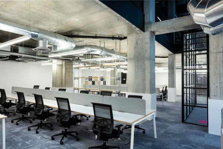
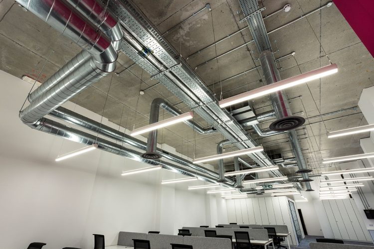
We worked in close collaboration with the Wowcher team to create something that not only reflected their brand, but also provided a fun and dynamic space that could bring staff together. We carefully considered this balance of work and play, and designed each space with its intended function in mind. By procuring unique furniture and altering existing building services, we were able to create very distinct spaces that felt part of the same brand.

_BC_4921-1-mgps

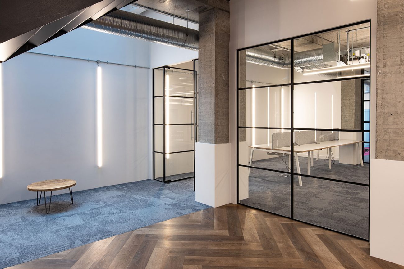
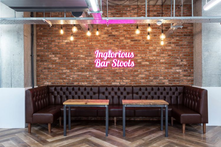
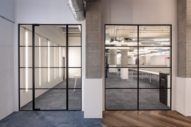
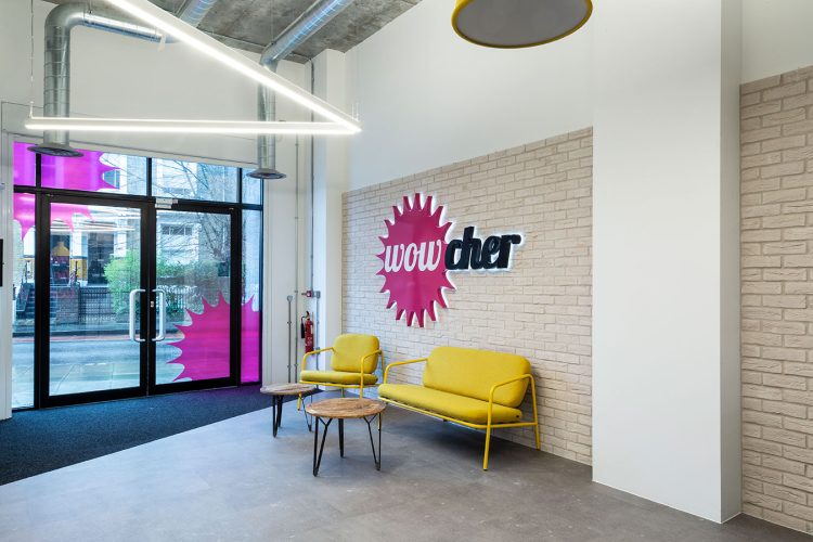
Crittall effect, glazed partitions helped bring a level of transparency and light into work and meeting areas, whilst still providing that all-important privacy. We also introduced large wall graphics and feature colour walls to brighten these more formal working areas. As the reception was the first point-of-contact for employees, clients and visitors, we created a high-impact and welcoming space with brick walls and neon signage that reflected its prime location in the city. To finish it off, we commissioned a local furniture maker to craft a bespoke reception desk that pulled everything together.

Voucher-Shoot-Feb2020-9108-mgps
_BC_5096-1-mgps
_BC_4967-1-mgps1

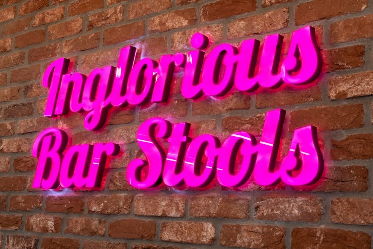
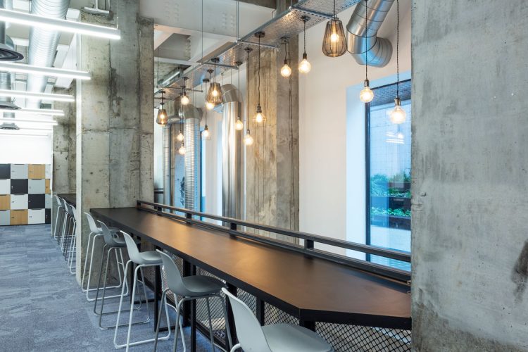
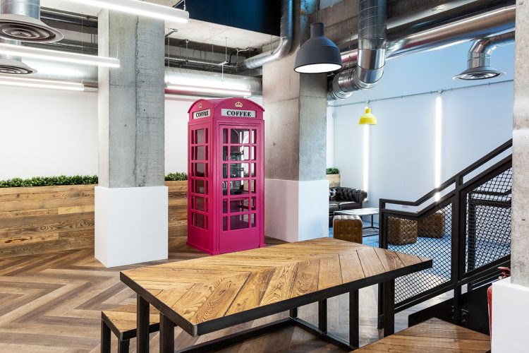
The basement offered staff the space to relax on breaks and also provided a more collaborative working environment. To encourage this creativity, we designed a space inspired by the Shoreditch grind theme, with interchangeable, cinema-effect signage above the large breakfast bar, and a pink phone box that doubled as a coffee station. Industrial-style timber cladding and brickwork were contrasted with pink neon wall signs that gave the space vibrancy and character. We also continued the bespoke joinery into the basement, with robust scaffold shelving and custom social booths, complemented by the detail in the Herringbone vinyl flooring.

_BC_5150-1-mgps (Banner; 2500 x 650 px)